Scaling a design system across multiple brands while retaining each one’s unique visual identity is no easy task. At rtCamp, we’ve developed an approach that blends design and engineering to support brand consistency, creative flexibility, and operational efficiency.
This outlines how we implement a reusable multi-brand design system, particularly within WordPress multisite and standalone environments, drawing from real-world enterprise use cases. From the first WordPress design tokens to the final editorial workflow, here’s a closer look at how a robust, scalable design system for WordPress comes together, solves real problems, and adapts as brands grow.
The working model
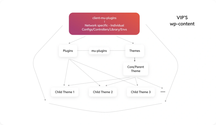
Building a multi-brand WordPress design system starts with a structured model that bridges design and development. Over time, we’ve refined this into a repeatable framework ideal for enterprise-grade WordPress environments.
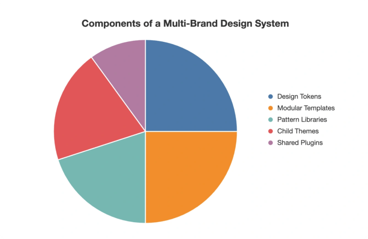
- WordPress design tokens define the foundation
- Modular templates and a WordPress pattern library enable reuse
- A parent/child theme architecture supports scalability and flexibility
Step 1: Designers lay the foundation
When onboarding a new brand, designers start with a shared base: global design tokens in Figma. These are atomic elements like colors, typography, and spacing that form the foundation of the system.
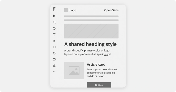
We establish a global design system in WordPress with shared tokens like a base typography scale and neutral spacing grid. On top of that, brand-specific tokens such as primary colors and logos are layered in.
Designers propose new layouts or blocks in Figma, beginning with wireframes for components like hero banners or article cards. These are reviewed collaboratively to ensure cross-brand reusability. For instance, a card component built from smaller parts like headings, images, and CTAs might use a shared layout but allow for brand-specific colors and typography.
Step 2: Developers build for reuse
Once approved, designs are implemented in the WordPress theme architecture. In a WordPress multisite design system, we use:
- A parent FSE theme containing all shared design system components
- client-mu-plugins for shared backend logic (SEO, analytics)
- theme.json for centralized theme management
Child themes inherit all shared assets, enabling brand-level divergence where needed. For example, brands may use unique content types or visual tweaks.
When new blocks are designed, developers implement them using Gutenberg or ACF, styled with CSS, and performance-optimized (e.g., lazy loading, WebP support). These blocks are added to the parent theme’s pattern library and made available across all sites. In non-multisite setups, we distribute shared components via a custom plugin to maintain consistency.

Step 3: Editors get a flexible, on-brand experience
Editors use the WordPress block editor to work with the unified design system directly.
They select from a pattern library of pre-approved blocks like article teasers, CTAs, or layouts, ensuring brand consistency without needing design expertise.
Shared backend plugins take care of analytics, SEO, and other non-visual tasks, streamlining the editorial workflow.
The modular structure means editors can quickly create new pages by dragging and dropping components, without worrying about breaking brand guidelines maintains alignment with brand design systems.
Balancing shared and brand-specific elements
A key part of making this work is knowing what to share and what to keep separate. Here’s how we typically draw the line:
Shared components (in parent theme or shared library):
- Typography scales
- Spacing grids
- Layout templates
- Core UI blocks (buttons, headers, footers)
Brand-specific components (in child themes or site-specific plugins):
- Color palettes and logos
- Unique content types (e.g., podcast or review sections)
- Brand-level visual tweaks
Example: When onboarding a new brand, we reused an existing article card block and reskinned it with that brand’s teal palette and custom font. This saved roughly 40% of development time compared to building from scratch.
We’ve also dealt with edge cases like custom typography breaking the shared layout grid. In such cases, fallback fonts defined in theme.json help preserve structure across brands.
Keeping Figma and code aligned
Design and development sync is critical.
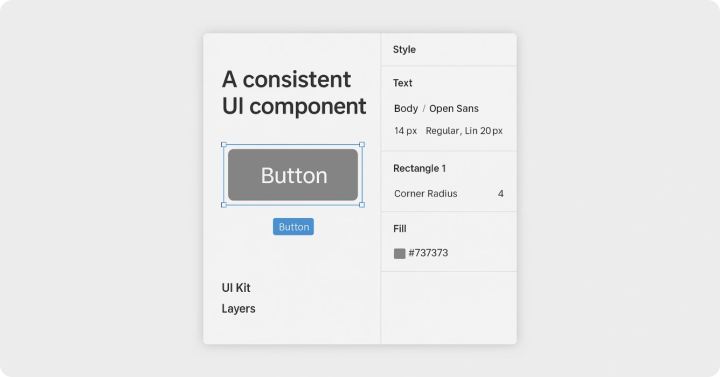
Designers maintain a central UI Kit in Figma that mirrors the global design system. Developers ensure this stays in sync using a custom template rendering workflow, so blocks in the WordPress editor always match their Figma counterparts.
For example, if a designer updates a button’s border-radius in Figma, developers reflect that change in the parent theme’s CSS, and it flows down to all child themes.
Real-world impact
In one enterprise setup, we helped onboard a new publication in just three weeks, half the usual timeline.
Here’s how the workflow played out:
- Design: Brand-specific tokens (like a red color scheme) were defined in Figma, reusing the base layout grid and typography system
- Development: A new child theme inherited the parent FSE theme, with added custom post types for content like reviews
- Editorial: Editors used the block editor to build pages from shared patterns and launched quickly after the content migration
The outcome? The new site preserved brand identity, cut development costs by 30%, and improved Core Web Vitals by 20% thanks to optimizations like Tailwind CSS and async JS loading. The same system helped onboard two more brands the same year, without rework.
What makes this approach work
A few key practices make a multi-brand design system sustainable and scalable:
- Define boundaries early
Clearly separate what’s global and what’s brand-specific to avoid confusion and conflicts as you grow. - Maintain a shared design source
A central UI Kit and design documentation help onboard new teams faster and keep everyone aligned. - Test across use cases
Regularly validate shared components to ensure they hold up across different brands and layouts.
These principles help keep the system stable, adaptable, and easy for new teams to plug into, no matter how many brands you’re supporting.
Conclusion
A multi-brand design system isn’t just about reusable components, it’s a framework that aligns design, development, and editorial teams. With shared design tokens, modular templates, and a scalable theme structure, brands can launch faster and stay consistent.
Whether you’re using WordPress Multisite or standalone sites, the approach stays the same: identify what’s reusable, plan for what’s brand-specific, and keep design and code in sync.
This is the kind of foundation OnePress is built to support.
OnePress isn’t a product, it’s a modular approach. Built for multi-brand enterprises, it’s designed to reduce overhead, increase speed, and give teams more flexibility. It adapts to your tools, workflows, and governance models and doesn’t lock you into anything new. You stay in control of your stack.Explore the OnePress Handbook to see how leading enterprises are evolving their WordPress strategy for scale.
The working model
Step 1: Designers lay the foundation
Step 2: Developers build for reuse
Step 3: Editors get a flexible, on-brand experience
Balancing shared and brand-specific elements
Shared components (in parent theme or shared library):
Brand-specific components (in child themes or site-specific plugins):
Keeping Figma and code aligned
Real-world impact
What makes this approach work
Conclusion
On this page
Credits

Mukul Singh
Author
Mukul Singh
Author

Shreya Agarwal
Editor
Shreya Agarwal
Editor
Shreya Agarwal is a Growth Engineer at rtCamp, she brings active, hands-on WordPress development credentials to everything she writes and reviews. A WordPress Core Contributor with merged pull requ…
Related articles
-
How multi-brand teams eliminate content duplication with a shared content hub
Articles
-
How to set up WordPress multisite for multi-brand enterprises
Articles
Comments
Leave a Reply Cancel reply
Name*
Email*
Comment*
Submit
Δ